About The Project
'Til the booming end is a personal project put together by my brother Heyden and I. The project took more then 2.5 years to put together working on it as a side project. The original concept came to me when looking for a personal project that did not require much screen, with a focus on traditional pencil and ink drawings.
Heyden and I are the founders of Part-time Pirates, a pirate/punk band based in Johannesburg. We had written dozens of pirate/celtic songs over the last 15 years and wanted to take the best lyrics, transcribe them into poetry and put an illustrated book together. Each of the poems and illustrations to be stand-alone stories, without continuality.
The Drawing Process
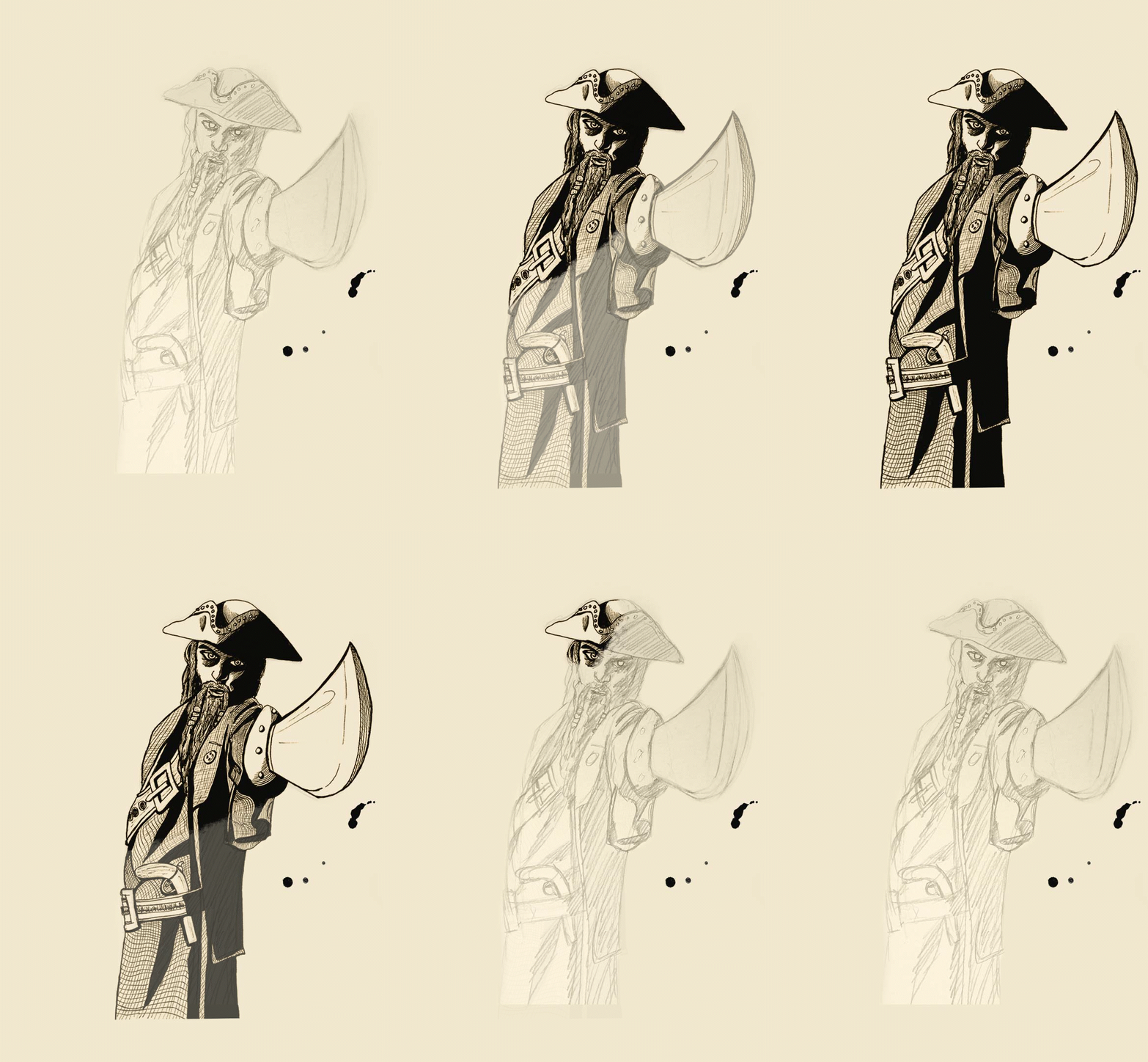
We collected a total of 24 poems that we wanted to illustrate and got to work with pencil sketches. The sketching took about 1 year, working on the project on weekends and afterhours.
I used HB pencils and a 0.3mm clutch pencil and lots of led. Most of the illustrations were drawn on A4 paper, because the smaller page size required less detail. I did draw about 5-6 illustrations on A3 pages to be used for large pages and spreads.
The Inking Process
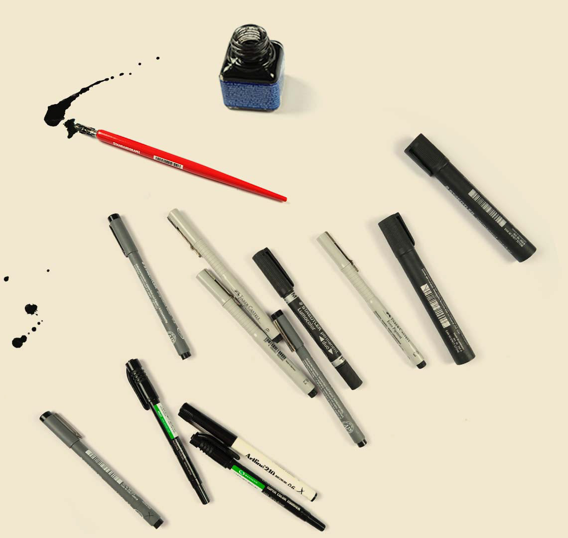
The inking started after all drawings were complete. I used 0.2/0.3/0.4mm fine tip pens and Thick edged permanent markers.
The inking took about 1.5 years, working on the project on weekends and afterhours. I completed 23 illustrations in total and Heyden completed 1 as a ‘bonus’
The Book Layout
I choose 2 adobe fonts to be my primary fonts ‘Antiquarian Scribe’ for headings and ‘Poetica Std’ for paragraphs. I wanted the book text to look somewhat handwritten, And the whole book to be well designed, but look old-fashioned, or put together by hand.
The Cover
I decided to go with my favorite illustration completed ‘Salty Sam’ and digitally colour it using my Huion graphics tablet. I wanted to incorporate rich, vibrant colours and make the title text in black and white. I used a cloud scape photograph from my personal library for the background and liked how the colour all came together in the end.
The back cover I used a wood texture photograph for the background which flowed nicely with the ship in the front cover. The letter I used some ink splatters and cup stains To make the illustration look ‘lived in’ and hand made in a way. Overall very happy with the outcome.

